When It’s Okay to Judge a Book by Its Cover
How comic book illustrators use design
and what modern designers can learn from them.
In the world of comics, the cover isn’t just a protective wrapper, it’s a battle cry, a billboard, and a promise all rolled into one. It’s the first impression that convinces you to pick the book up, flip it open, and step inside an entirely new world.

No matter how good a story is… you can spot the artwork instantly… and you know whether it grabs you or not.- Stan Lee
It probably won’t shock anyone who knows me, but yeah, I’ve always been a comic book nerd. As a kid, I wasn’t just reading comics for the stories, I was obsessed with the art, the colors, the wild energy bursting off every page. While other kids were playing video games, I was the kid chasing down the latest issues because the covers looked too good to walk past.
Honestly, comics are the reason I became a graphic designer. They showed me that a single image can hook you, sell you, and transport you into another world all at once. That’s powerful stuff and it’s exactly the kind of magic designers and marketers are still chasing today.
So yeah, let’s dive into it: how comic book art and design sneakily double as a masterclass in marketing and graphic design.
Comic book covers are works of marketing design at their finest. They distill an entire story arc into a single, striking image that has to compete with dozens of others on the shelf. The typography, the color choices, the composition, every detail is designed to make you stop and stare. In many ways, comic illustrators were doing what advertisers and graphic designers strive for long before “brand storytelling” was a buzzword.
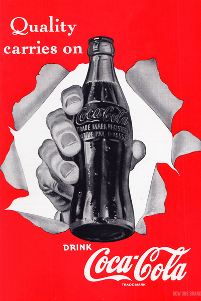
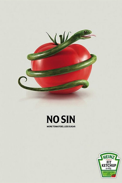
Today, their influence is everywhere. From movie posters that echo comic book layouts to bold advertising campaigns that borrow comic-style illustration, the DNA of comic cover design runs deep in the broader design and marketing world. These covers teach us that the best design doesn’t just decorate, it communicates, persuades, and sells.
So yes, when it comes to comic books, it’s more than okay to judge a book by its cover. In fact, that’s exactly what the artists intended.
Comic book covers aren’t just art, they’re storytelling in miniature, powered by decades of design know-how and marketing savvy.
-
The Art of the First Impression
We’ve all heard the expression, “don’t judge a book by its cover.” But in the comic book world, judging a book by its cover isn’t just okay, it’s required. In comics, the cover is the handshake, the wink, the opening act. It’s the single-page elevator pitch that must grab your attention, spark your curiosity, and promise a ride worth taking.
Step into a comic shop, and you’re bombarded with colors, characters, and chaos, all competing for your glance. In that split second, a single image must do three things: grab attention, spark curiosity, and hint at the world inside.
That clarity of purpose, making the message snap into focus instantly, is what elevates a comic cover from decoration to instant storytelling. And as Stan Lee reminded us through Spider-Man, “With great power comes great responsibility.” Comic artists understood that power: a single image had the responsibility to sell the entire book.
-
Design Principles Hiding in Plain Sight
The cover is a tiny canvas packed with signals and when it’s done right, you don’t just see it. You feel it.
Comic covers double as teaching tools for smart designers, built on rock-solid foundations:
Composition & Hierarchy
Strong diagonals and focal points command attention.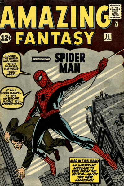
Typography & Logos
The masthead (think Superman or Batman) isn’t just a title, it’s a brand.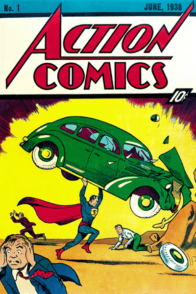

Color Psychology
Red signals urgency, blue evokes mystery, neon radiates energy.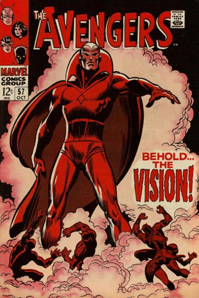
Symbolism
A lone mask or shattered skyline can whisper more narrative than any speech bubble.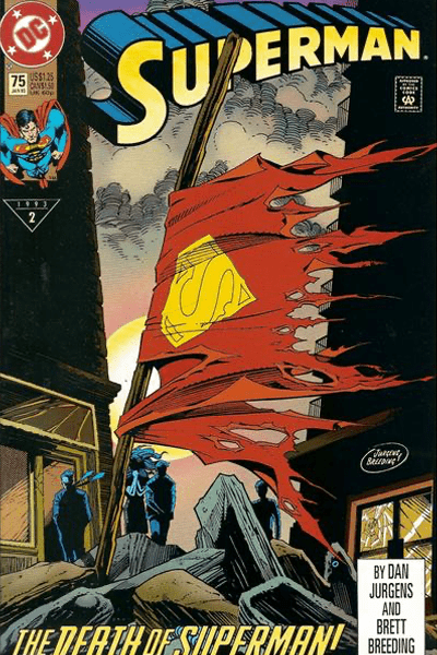
-
From Comic Shops to Marketing Blueprints
Comic book covers weren’t just designed to sell stories, they became miniature advertisements long before “buy now” buttons existed. Variant covers hinted at scarcity. Bold color schemes built emotional shorthand. Iconic heroes taught the art of character-driven branding.
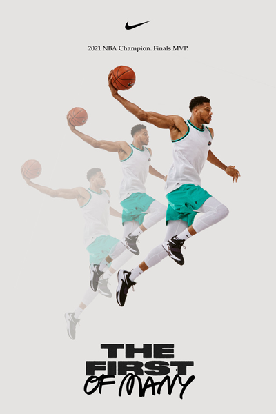
Marketers noticed. The sense of collectability, the clarity of message, the power of personality, all lessons first honed in comic shops, now echo across modern industries. You’ll find them in sneaker drops, movie posters, digital campaigns, and even landing pages.
A great comic book cover doesn’t just draw you in, it makes a promise. Sometimes it’s a whisper, sometimes it’s a shout, but always: “Here lies a world worth your time.”
For designers, the takeaway is powerful and beautifully simple: Don’t just make something that looks good. Make something that communicates, connects, and convinces.
So yes, when it comes to comic books (and smart design everywhere), judging a book by its cover isn’t only okay, it’s expected.
Ready to Build Something Amazing?
Let's discuss how we can help bring your digital vision to life with cutting-edge technology and exceptional user experience.